How to Create a Sales Page for Your Online Course that Converts [Step-By-Step Guide]
11 minute readIn the world of online courses, having a well-designed sales page is crucial for converting potential students into paying customers.
A sales page that effectively communicates the value of your course and addresses the needs of your target audience can significantly boost your course enrollment rates.
In today's blog post, we will explore the essential elements that make a sales page convert, along with a step-by-step guide on how to create a compelling sales page for your online course.
What is a Sales Page?
A sales page is a dedicated web page designed to promote and sell a specific product or service, with a strong focus on persuading potential customers to make a purchase.
For creators selling online courses or any other digital products, sales pages are a great way to educate potential customers about the value of their course and provide more information, as well as a clear place where to purchase the course.
The main goal of a sales page is to convince visitors that the product being offered provides substantial value and benefits, ultimately leading to a conversion.

Long vs Short Form Sales Pages
Long-form sales pages are extensive and detailed, often requiring visitors to scroll down to access all the content. A long-form sales page can be several thousand words long and include various sections and multiple calls to action.
Short-form sales pages are concise and to the point, providing essential information without overwhelming the visitor. Short-form sales pages work well when the target audience is already familiar with the creator or product, or when the offering is straightforward and doesn't require extensive explanation.
Whether long-form or short-form, a well-crafted sales page is a crucial asset for creators selling online courses, it serves as a powerful marketing tool, effectively conveying the value of the course and encouraging potential customers to make a purchase decision.
Related article: The Complete Guide to Increase Website Traffic for Creators and Solopreneurs
What to Include in Your Sales Page for Optimal Conversions
Before diving into the creation process, let's first understand the key elements that can make your sales page highly effective.
#1: Write Clear and Attractive Copy
Crafting compelling headlines and persuasive copy that clearly communicate the benefits of your course is of the utmost importance when it comes to your course sales page.
Use language that resonates with your target audience and highlights the unique selling points of your course.
When consumers have to choose between two similar products, they naturally look for signs that one product better suits their needs and values.
Even if you have built an awesome course that perfectly matches your target audience's needs, it won't lead to sales if you don't clearly communicate its value on your sales page.
To create an effective sales page for your course, consider two main crucial aspects:
- The Copy: Your choice of words should be persuasive and extremely clear, as this helps build trust with your audience and allows them to connect with you and truly understand what your value proposition is.
- The Structure: However, having good copy alone isn't enough to guarantee sales. You must also ensure that your sales page is logically structured, making the purchasing process seamless and effortless for your potential customers. Organizing the information in a clear and easy-to-follow manner increases the chances of converting visitors into buyers.

When it comes to great copywriting, it is a good idea to focus on highlighting the benefits and results that your course offers rather than just listing features.
Make sure to address all of your potential students' pain points, using clear and concise language, providing social proof, and answering common customer questions in the text of your sales page.
Additionally, the copy should be visually easy to read by adding headers, subheaders, bullet points, images, and videos to keep website visitors engaged.
If you want to learn more about copywriting, check out this article from our blog: Copywriting Tips to Sell More Online Courses
#2: Solve Your Customers' Pain Points
Another important part of your sales page copy is to offer solutions to all of your customers' pain points and struggles.
Before you start building your landing page, research the pain points and challenges your potential customers are facing. List them out and explain how your online course provides solutions and helps your potential customers achieve their goals: you should emphasize this on your sales page.
As we previously mentioned, effective copywriting should resonate with your readers, evoking a sense of understanding and portraying your online course as the ideal solution to their problems.
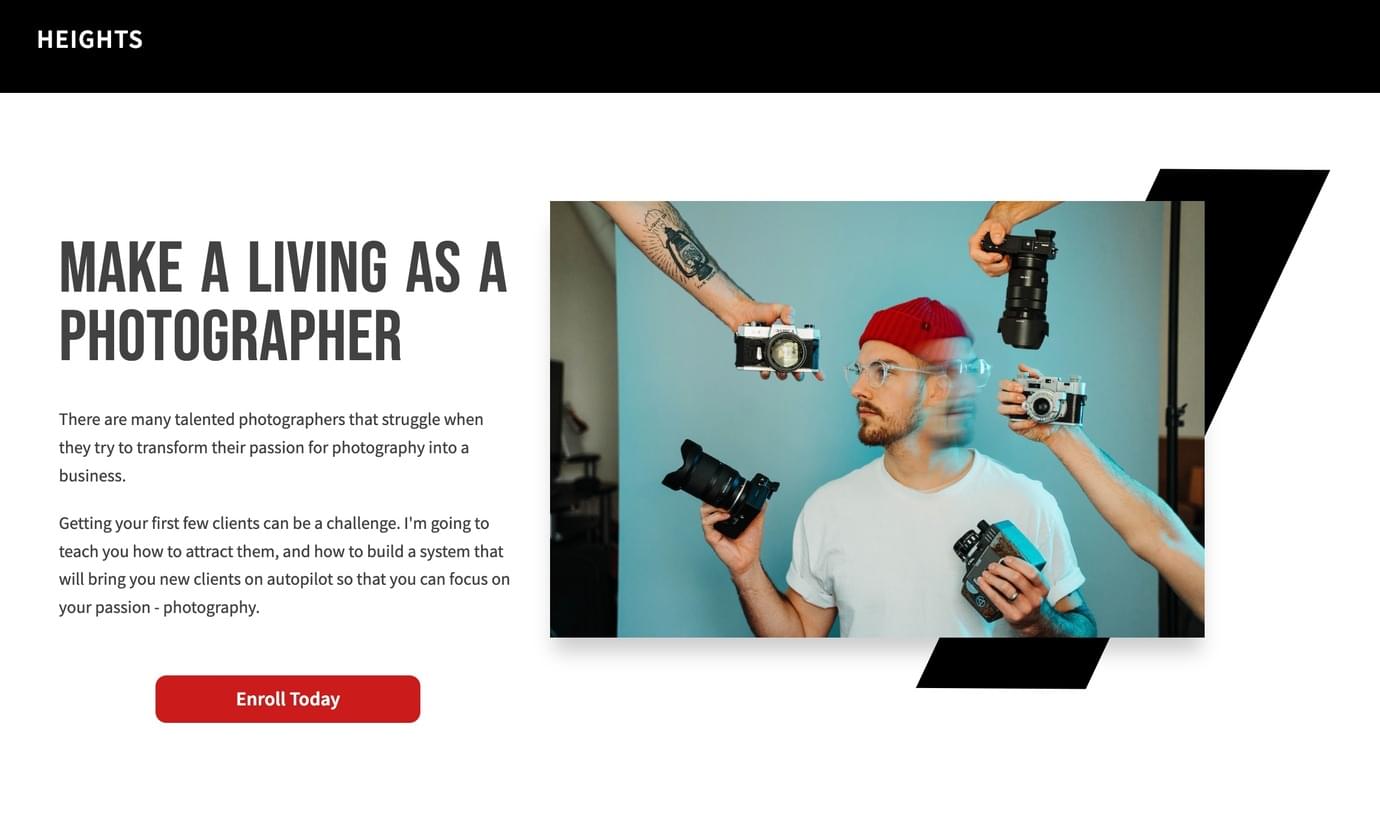
Therefore, it's crucial to address their most significant pain points in your writing - identifying the specific issues they seek to resolve through your course.
This approach allows you to establish a deeper connection with a diverse range of customers, as individuals with similar goals may have distinct backgrounds and motivations for enrolling in your online course.
For instance, if you are offering a Yoga course, your customers' pain points could range from anxiety and weight loss to fitness and stress management...
#3: Add Clear Call-to-Actions
Your sales page should guide website visitors to take a desired action (for example, enrolling in your online course). This can be done by incorporating clear and strategically placed call-to-action buttons.
In the context of a landing page, a call to action (CTA) typically seeks to persuade the reader to take a specific step that leads them further along the sales funnel or towards making a purchase.
The CTA is usually a clickable button or a clearly visible text link that stands out from the rest of the content on your page.
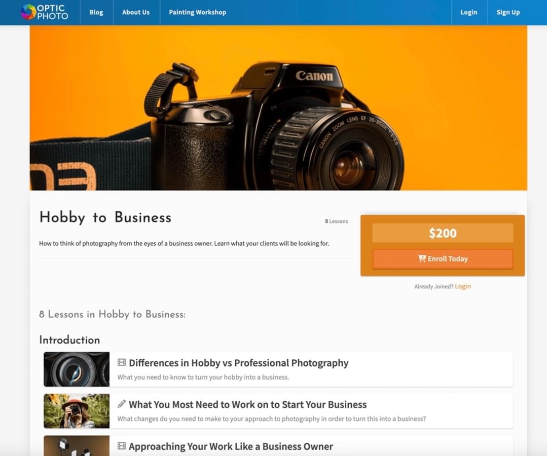
The primary goal of a sales page is to convert potential customers into actual buyers.
Visitors may feel lost or unsure of what to do next without a clear CTA after reading the sales pitch. The CTA provides a clear direction and guides users toward the desired action, so make sure to include multiple calls to action throughout your sales page!
#4: Add Reviews and Testimonials
A sales page that converts should showcase testimonials and reviews from satisfied students to build trust and credibility with new visitors.
Positive feedback from past students can greatly influence potential customers to make a purchase.
This is especially true when it comes to selling online courses and digital products. It can be challenging to communicate the value of your course since your customers can't physically touch or see it. That's why building trust and showcasing your authority in your niche is crucial.

One powerful way to do this is through social proof, like glowing reviews and customer testimonials.
Our blog has a helpful article explaining how you can easily collect positive reviews for your online course. Check it out here: 7 Quick Tips to Collect Reviews Easily and Increase Social Proof in Your Online Course
#5: Add an About Me Section to Establish Authority
Before buying an online course, many people often want to know who the course creator is.
To address this, you should include an "About Me" section that showcases your knowledge and experience in the subject. This will help potential students trust your expertise.
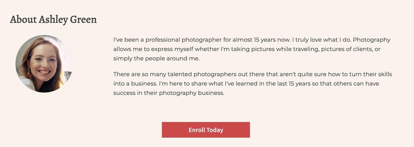
This kind of section within your landing page serves as a brief overview to establish your authority and credibility as the course creator.
Here, you can share details such as any awards you've received, qualifications, background story, and links to articles, interviews, or talks related to the course content.
It's a great way to show your qualifications and build confidence among potential students.
Related article: How to Position Yourself as an Expert to Sell Online Courses
#6: Create Urgency with an Offer
Creating urgency with an offer is a powerful marketing technique used to prompt potential customers to take immediate action and make a purchase.
By introducing a time-sensitive or limited availability offer to your sales page, you encourage potential buyers to act quickly, fearing they might miss out on a great deal or exclusive opportunity.
Here are some strategies to effectively create urgency with an offer on your sales page:
Limited-Time Discounts: Offer a special discount or price reduction for a short period. Example: "Enroll within the next 48 hours and get 25% off the regular price!"
Early Bird Access or Pre-Sale: Provide early access to your course or exclusive content for those who enroll before a specific deadline. Example: "Be among the first 50 students to enroll and gain access to our exclusive bonus module!"

Limited Availability: Highlight the limited number of spots available for your course, creating a scarcity mindset. Example: "Only 10 spots left! Enroll now before they are all taken!". You could also tie your offer to a specific holiday or season (ex: "summer sale")
Bonus Offers: Offer time-sensitive bonuses that are only available for a short period, encouraging potential customers to make a quick decision. Example: "Enroll today and receive a free one-on-one coaching session (a $100 value)!"
Countdown Timer: Use a visible countdown timer on your sales page, indicating the time remaining for the offer.
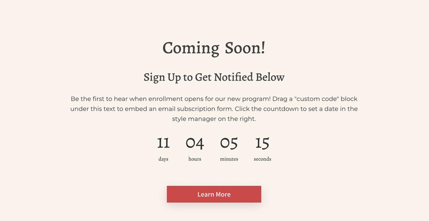
Please note that it is important to strike a balance when using urgency tactics, and not overdo it.
Be transparent and honest with your audience about the limited availability or time-sensitive nature of the offer. Overusing urgency or creating false scarcity can lead to a loss of trust and credibility with your audience.
#7: Add a Refund Policy to Reassure Potential Customers
If you haven't considered offering a refund policy for your online course students, then you should think twice, as this tactic can go a long way to increasing your sales and conversions.
One common refund policy used by online businesses is the "money-back guarantee." This policy reflects the seller's confidence in their product. If a buyer is dissatisfied with the purchase for any reason, they can request a full refund.

This approach is effective because it provides reassurance to even the most cautious buyers.
Those who might hesitate to make a purchase feel more secure knowing they have the option of getting their money back if the product doesn't meet their expectations.
A transparent refund policy can alleviate the fear of commitment and provide potential customers with confidence in their purchase decision: so make sure to add yours very clearly to your landing page!
#8: Add a Lead Magnet to Capture Visitor Emails Even If They Don't Purchase
Not all of the people who visit your landing page are ready to buy - but they still might be interested in what you are offering.
To make sure that you don't lose the opportunity to connect with these kinds of leads, you should have something in place to capture their contact information.
A lead magnet does just that: it is generally a digital product (such as an eBook, PDF, video etc...) given away for free to collect a prospect's contact details for future promotions.
By using a lead capture tool, you can effortlessly collect leads while providing immediate value to prospects through the free offering, which justifies asking for their contact details.

Lead magnets are especially advantageous as they tap into the power of email marketing and are generally simple and cost-free to create.
So consider offering a valuable free resource, such as a downloadable ebook or a mini-course, in exchange for visitors' email addresses and adding it to your sales page. This way, you can nurture leads and potentially convert them into customers later.
How to Create a Sales Page for Your Course
Now that you know all about the most crucial elements that your landing page should include, let's see how you can practically create a sales page to promote your online course.
Step 1: Use a Sales Page Builder
Unless you are an expert at web development, you need a platform that allows you to build your online course sales page easily.
A landing page or sales page builder is a valuable tool that simplifies the process of creating a professional and visually appealing sales page for your online course. It allows you to design and customize your sales page without coding or technical expertise.
Heights Platform's Web Page Builder is a fantastic example of such a tool, providing a user-friendly interface and a range of features to help you build a compelling sales page for your course.
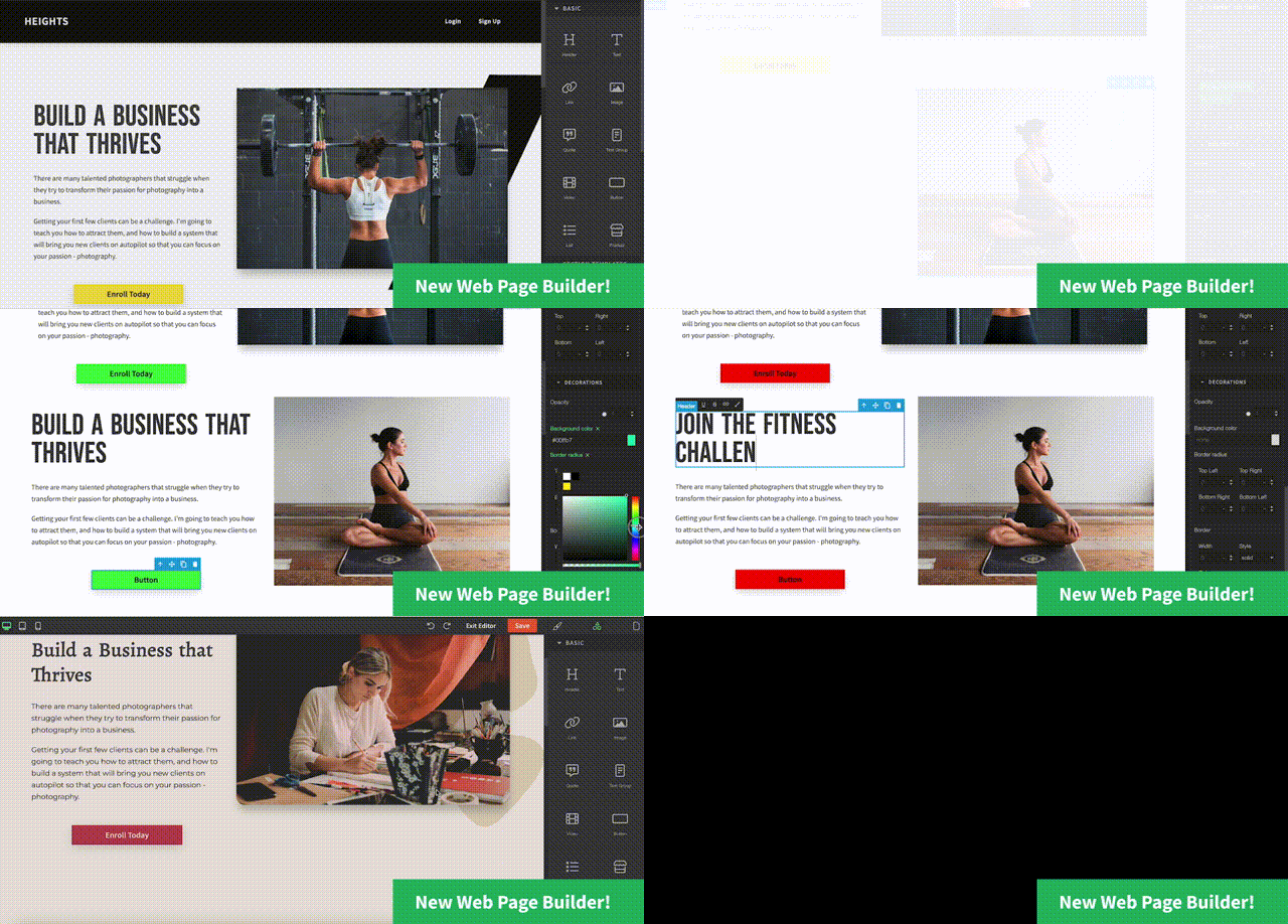
If you are on the Pro or Academy plan, the Web Page Builder is included in your subscription, making it a convenient and cost-effective solution.
Here are some features that you should look for in a landing page builder, all of them are included in the Web Page Builder in Heights Platform:
- No Coding Knowledge Required: The best sales page builders are designed with non-tech-savvy users in mind. With Heights Platform's Web Page Builder, you don't need to have any coding knowledge or design skills to create a stunning sales page. The builder offers a drag-and-drop interface to easily add, move, and customize elements.
- Ready-Made Templates: Look for a sales page builder that offers a selection of ready-made templates designed by professionals. These templates serve as a starting point for your sales page, saving you even more time and effort. In Heights Platform, you can choose between different templates and customize them to match your branding.
- Customization Flexibility: While templates provide a great starting point, sales page builders should also allow you to customize every page element. In the Web Page Builder, you can change the text, images, colors, fonts, and layout to create a unique and branded sales page that stands out. You can also choose among section templates to quickly add new sections to your page, and - if you feel courageous - add custom code to your page.
- Mobile Responsiveness: A great sales page builder should ensure that your sales page is mobile-responsive, meaning it will adapt and look great on various devices like smartphones and tablets. With a significant percentage of internet users accessing content on mobile devices, this feature is essential for a seamless user experience.
Create unlimited sales pages and website pages using Heights Platform's Web Page Builder!
Create Your Course Sales PageStep 2: Plan the Content in Advance
Before you dive into the Web Page Builder, it is a good idea to plan the structure and content of your sales page.
Take the time to outline the key elements you want to include, such as attention-grabbing headlines, compelling copy, impactful testimonials, and clear call-to-action buttons.
By having a well-thought-out content plan, you can ensure that your sales page delivers a cohesive and persuasive message that resonates with your target audience, increasing the likelihood of converting visitors into paying customers.
Step 3: Choose a Ready-Made Template and Edit
Once you have signed up for Heights Platform to use the Web Page Builder and outlined your page's content, it is time to start creating your first sales page!
Start by clicking on "+ New Page" in the Web Pages section of your Heights account.
Here you can choose between a variety of ready-made templates according to your liking.
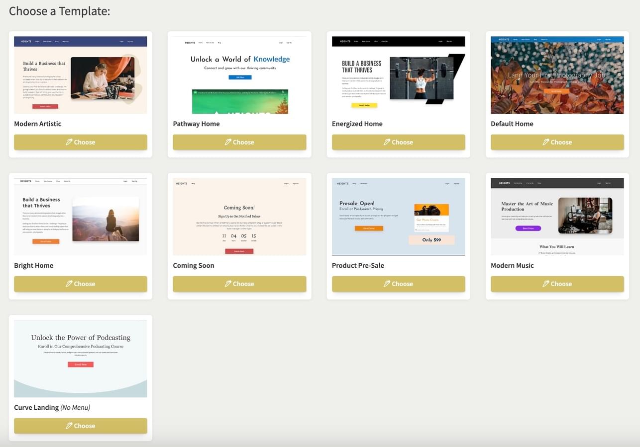
After finding your preferred design, choose it and begin editing the page.
Within the editor, you have the freedom to modify anything from the sales page template, incorporate additional sections, and design a web page that aligns with your brand style and preferences.
The Web Page Builder not only enables you to craft a dedicated sales page for individual products but also empowers you to build your entire website within Heights Platform.
The best thing about Heights Platform's Web Page Builder is that it is integrated into your course creation platform. This means you can easily link to your courses and digital product without building the UI from scratch.
Heights Platform automatically populates the content within your sales page with relevant information about your courses, simplifying the process for you.
For example, you can add a product card for your online courses to your sales page in seconds, as shown below:

Step 4: Pay Attention to SEO
Another tip to craft a great sales page is to optimize it for search engines by incorporating relevant keywords and providing sufficient content to explain your course comprehensively.
SEO is a powerful way to attract customers passively by adapting your website for search engine visibility.
It involves targeting the right keywords, improving on-page SEO, seeking backlink opportunities to boost your website's credibility and search engine ranking, and more.
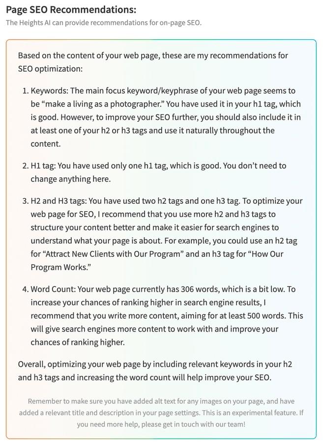
By using AI tools like Heights AI in Heights Platform, you can receive personalized recommendations and assistance to optimize your web pages for better SEO performance and overall success.
Learn more about this: Best AI SEO Tool for Course Creators and Coaches
Step 5: Edit Page Settings & Publish
After you have finished personalizing the design and content of your page, navigate to the page settings to publish and configure some SEO details.
Here you can specify a page title, meta description, and page URL, which will be displayed on search engines.
When you are satisfied with the setup, click on "Publish," and your page will be live and accessible to your audience!
Create Your Online Course Sales Page With Heights Platform
To conclude, a well-designed sales page is crucial for the success of your online course business.
It serves as a powerful marketing tool, effectively conveying the value of the course and encouraging potential customers to make a purchase decision.
To create an effective sales page, focus on crafting clear and attractive copy, addressing your customers' pain points, adding clear call-to-actions, showcasing reviews and testimonials, establishing authority through an "About Me" section, creating urgency with offers, offering a refund policy for reassurance, and capturing visitor emails through lead magnets.
Heights Platform's Web Page Builder simplifies the process of building a sales page or even a whole website (with unlimited pages!), allowing you to build a beautiful and converting landing page without coding or technical expertise!
Try the Web Page Builder yourself by creating your free Heights Platform account today!
Create Your Course Sales Page![Heights Platform How to Create a Sales Page for Your Online Course that Converts [Step-By-Step Guide]](https://uploads.heightsplatform.com/program/public/blogarticle/676/cover_image/original-1f04454c29d44b543f4b3a600f122462.png)


