4 Types of Landing Pages for Your Online Course Business
9 minute readIf you sell online courses, you need a landing page or a website where potential customers can purchase your course and become new students.
A course landing page does more than just provide a place for accessing and buying your program. It's a tool to inform and convince every visitor on your site about the value of your course.
You might think that creating a course landing page is not as important, especially after spending weeks or months developing your course materials. But a course landing page can be a great marketing tool. The content, design, and promotion strategies of your landing page can significantly influence your sales.
So, how can you create a course landing page to promote your business?
In today's blog post, we'll show you 4 examples of online course landing pages you can create today, and share our favorite tips to build a converting landing page.
4 Types of Online Course Landing Pages
#1: Online Course Website
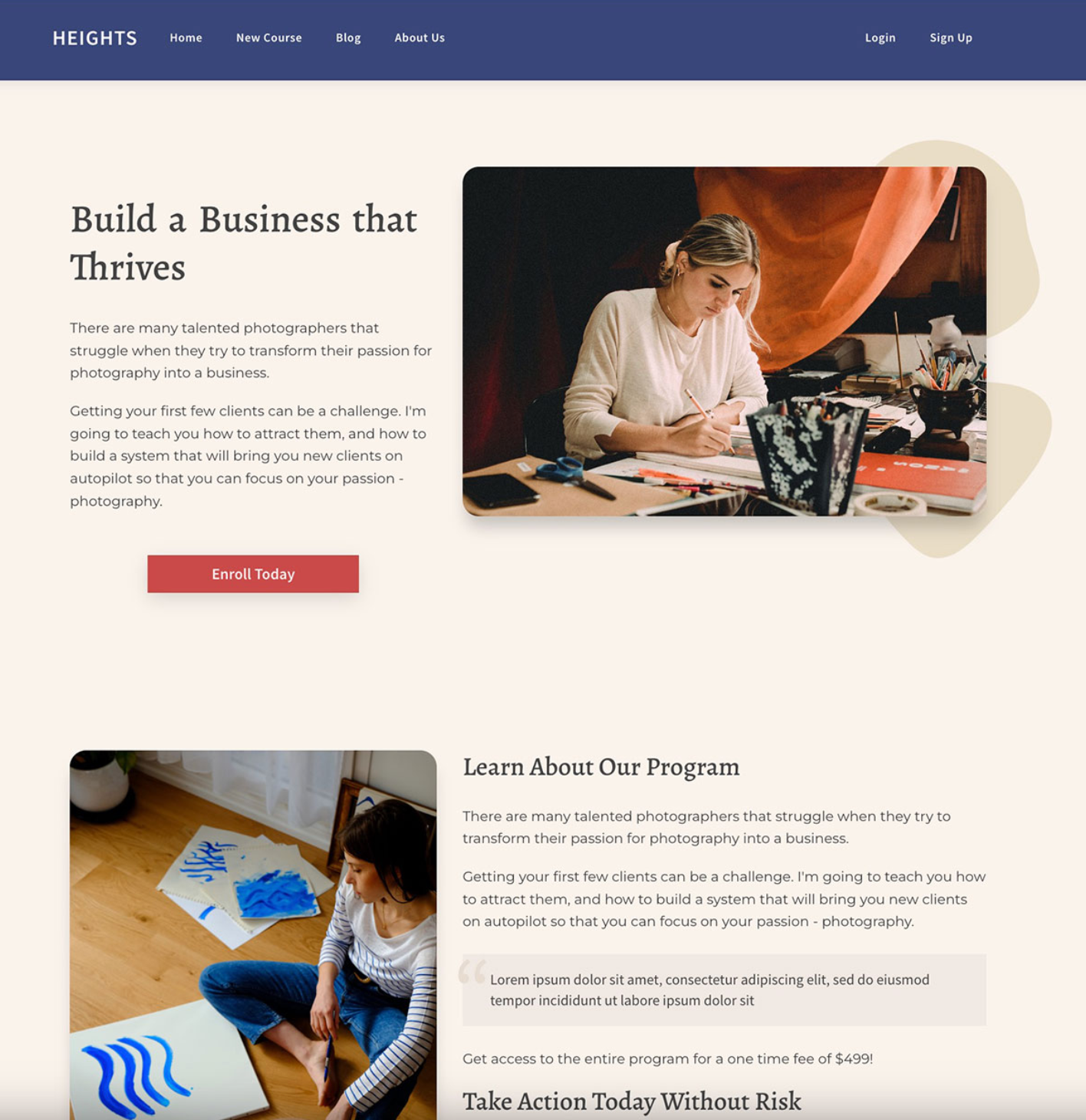
An Online Course Website serves as the comprehensive digital storefront for your online course business.
It not only introduces future students to your brand but also provides detailed information about the courses you offer.
Rather than guiding potential students to a purchase (which is the goal of a landing page), an online course website offers information about your business and the services that you provide.
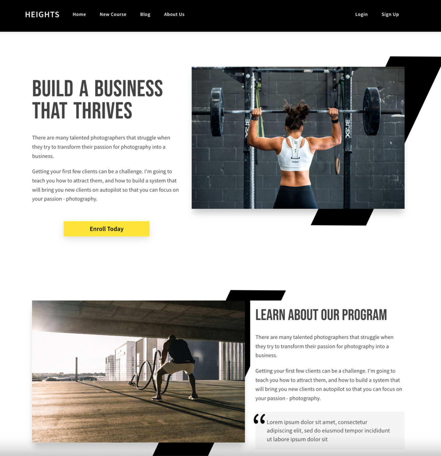
These kind of websites are usually composed of multiple pages, such as:
- About Us: This section is where you share your story, mission, and the expertise behind your courses. It’s a chance to connect personally with your audience and build trust. Highlight your qualifications, experience, and any unique aspects that set your courses apart.
- Services and Course Page: Here, you provide detailed information about each course, for example, the learning outcomes, curriculum, duration, and any unique selling points. For businesses offering multiple courses, this section can be broken down into individual course landing pages, each tailored to a specific course.
- Other Products or Services: If your business offers more than just courses (like eBooks, webinars, coaching sessions, etc.), this section can showcase these additional offerings. It’s an opportunity to cross-sell and increase the value you provide to your students.
- Contact Us: An essential part of any business website, this section should include various ways to contact you, like email addresses, phone numbers, and a contact form. It’s also a good place to link your social media profiles and provide a physical address if applicable.
- Testimonials and Reviews: Including a section for student testimonials and reviews can significantly boost your credibility. Sharing success stories and positive experiences from past students can persuade future students of the value and effectiveness of your courses.
- Blog or Resources: Offering a blog or a resources section with free content related to your courses can help in attracting and retaining visitors. This content can position you as an authority in your field and improve your website’s search engine optimization (SEO).
Learn more about designing your course website:
- The Complete Guide to Increase Website Traffic for Creators and Solopreneurs
- New Updates to the Web Page Builder in Heights Platform: How to Build an Online Course Website
How can I build an online course website?
Heights Platform's web page builder allows you to design a website with unlimited pages using ready-made templates and an easy editor.
Plus, Heights Olatfprm is an online course creation software, which means that you can link your website easily to your courses and digital products and only use one platform for course creation and web development.
Create Your Course Website Today#2: Online Course Sales Page

A sales page is a focused, single-page layout designed to convert visitors into paying customers.
This page should clearly articulate the unique value of your course, showcasing the benefits and outcomes students can expect.
For creators selling online courses or other types of digital products, course sales pages are a great tool to share the value of a course and provide more information to visitors.
The main goal of a sales page is to convince potential buyers that the product being offered is a solution to their problems, ultimately leading to a conversion.
A great sales page should include compelling course descriptions, instructor qualifications, pricing information, and a strong call-to-action (CTA) for enrollment.
Key Elements to Include:
- Compelling headline
- Course benefits and features
- Creator's qualifications and bio
- Pricing and payment options
- Strong, clear CTA for enrollment
Learn more about creating a course sales page:
- How to Create a Sales Page for Your Online Course that Converts [Step-By-Step Guide]
- How to Create an Online Course Sales Page in Minutes
How can I build this course sales page?
On Heights Platform, we have a web page template just for your course sales page! You can use our easy drag-and-drop web page builder to design unlimited web pages and promote your online courses.
#3: Pre-Sale Landing Page

A pre-sale landing page is designed to create excitement and urgency around a course that is not yet available but can be pre-ordered.
This page highlights the benefits of enrolling early, such as special pricing or exclusive content, and often includes an option to join a waitlist.
It's a great strategy for gauging interest and building an audience before the official launch.
Key Elements to Include:
- Pre-sale offer details
- Early bird pricing or special bonuses
- Waitlist signup form
- Course overview and expected outcomes
- Launch date countdown
Related articles:
- How to Pre-Sell Your Online Course and Profit Before the Launch
- Online Course Landing Page - 6 Things to Include to Maximize Conversions
How can I build this course landing page?
On Heights Platform, we have a web page template just for your course pre-sale course landing page! You can use our easy drag-and-drop web page builder to design unlimited web pages and promote your courses.
#4: Coming Soon Page
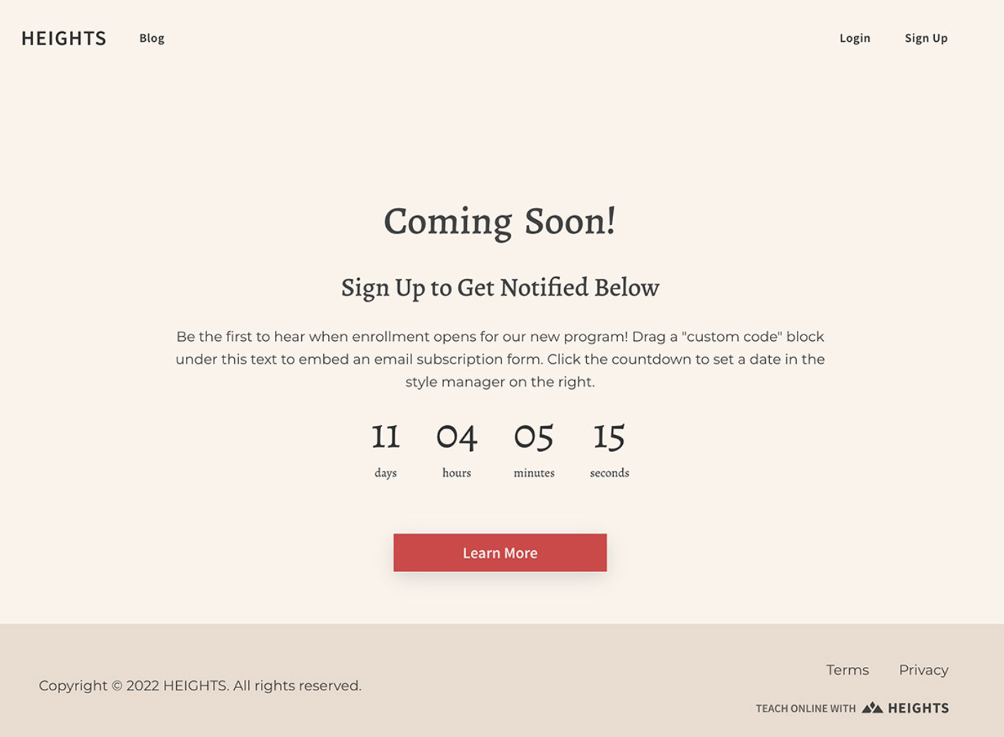
A Coming Soon Page is similar to the pre-sale page but typically used earlier in the product development cycle.
This page aims to generate interest and build an email list of potential students who want to be notified about the online course launch.
It should provide a tantalizing sneak peek of the online course content and benefits, encouraging visitors to sign up to stay informed.
Key Elements to Include:
- Brief description of the upcoming course
- Benefits of signing up for the waitlist
- Email subscription form
- Countdown timer until online course launch
- Social proof or endorsements (if available)
How can I build this course landing page?
On Heights Platform, we have a web page template just for your coming soon pages! You can use our easy drag-and-drop web page builder to design unlimited web pages and promote your online courses.
6 Elements to Design a Landing Page That Converts
Now that we shared a few examples of course landing pages you can create let's see what key elements you need to include inside a landing page to increase conversions.
Headlines
Your course landing page should explain not only what the course covers but also, more importantly, the benefits and results your customers can expect.
So, it is important that your headline and main title explain how your course can solve problems and transform the lives of your students.
The headline should either be your course's title or a phrase summarizing the transformation and benefits for your customers.
Remember to make promises you can deliver that are aligned with your course content to avoid customer dissatisfaction, and ensure that your course landing page is clear and engaging to encourage further exploration.
Website Copy
The goal of a course landing page is to clearly inform visitors about your course, answer potential questions, and convince potential students to enroll.
It is especially important to leave no doubts in the minds of potential customers, and you should be able to answer all of their questions in the text of the website.
So, when you are writing the copy for your course landing page, make sure to answer the following questions very clearly:
- What are you selling? Clearly describe your course and its outcomes.
- Why are you different? Share your unique value and what sets your course apart.
- Who is your course for? Specify your target audience.
- How does it work? Briefly explain your method and course structure.
Calls to Action
Calls to Action (CTAs) are a vital component of any course landing page, as they guide your visitors towards making a decision, like enrolling in your course.
They are typically presented as buttons or links with compelling phrases such as “Enroll Now,” “Join Today,” or “Start Learning.” The effectiveness of a CTA lies not just in its wording but also in its visual appeal and strategic placement.
A CTA that stands out due to its color and font yet harmonizes with your brand's style can draw the attention of visitors and prompt them to take action.
Social Proof
Social proof, such as customer testimonials and reviews, plays a crucial role in building trust and credibility among your website visitors.
When potential customers see positive feedback from others who have taken your course, it reassures them of the value and legitimacy of what you're offering.
Displaying these testimonials prominently on your landing page can significantly influence visitors' decision-making process.
If you're just starting and don't have many reviews, it's important to have a strategy in place to collect feedback from your initial customers. This could involve following up with them post-course completion or offering incentives for leaving a review.
Learn more about this: How to Collect Reviews for Your Online Course [5 Easy Ways]
Images & Videos
Images and videos can dramatically enhance the appeal of your landing page. They provide a visual representation of your course, giving visitors a glimpse of what to expect.
Images, whether they're photographs, graphics, or screenshots, can break up text, making the page more engaging and easier to digest.
Videos, on the other hand, are increasingly becoming an essential part of most digital marketing efforts, especially landing pages.
They can effectively convey the benefits of your course, showcase your teaching style, and give a brief overview of the content in a more dynamic and engaging way.
Related article: How to Record Professional Videos for Your Online Course
Information Hierarchy
The design and information hierarchy of your landing page is more than just aesthetic appeal; it's about creating a user-friendly experience that encourages engagement and conversion.
Information hierarchy in web design is the organization of content in a way that shows its relative importance and guides the user's attention.
A well-designed page is clean, easy to navigate, and consistent in style, which helps in building trust and perceived value in your offer.
Good design ensures that important elements like CTAs, social proof, and key information are easily noticeable and that the overall layout guides the visitor through the page smoothly.
While you don’t need to be a professional designer, understanding basic design principles and information hierarchy can go a long way in creating an effective landing page that resonates with your audience and encourages them to take action.
Bonus Element (For Heights Creators): Course Cards
If you are using Heights Platform to host your learning program, then you can add course cards to your landing pages and website!
As we will see later in the article, Heights creators can access a web page builder that allows them to design unlimited pages for their website.
The web page builder uses an easy drag-and-drop editor to create new designs, and creators can edit templates just as easily.
In the editor, you can drag and drop different elements on the canvas to compose your site. One of these elements is course cards.

Since Heights Platform offers both the opportunity to create and sell courses, plus build your entire website, everything is connected inside the platform.
This means that you can easily create course cards that are already linked to the products you sell inside Heights Platform (courses, challenges, digital products, bundles etc...)
You can drag and drop a course card on your page and set it. Then, when visitors click on it, they can be redirected either to the course landing page (automatically generated by Heights) or its checkout page.
This makes website building easier and quicker. If you had to design these kinds of course cards on your own, it would take a lot of time and web design expertise.
How to Build Your Online Course Website Using Heights Platform
Now that you learned about the elements you need to include in your landing page, let's see how you can create one!
Here's a straightforward guide on using Heights Platform to build your website.
Step 1: Start a New Web Page
First, go to the Web Pages section in your Heights account. Click on "+ New Page" and give your page a name like "About Us," "Home Page," or "Services." After naming it, click "Create Page."

Step 2: Pick and Personalize a Template
Next, it's time to choose a template.
Templates are pre-designed but can be customized to fit your style. You can change text, images, and colors or rearrange the layout.
If you prefer starting from scratch, you can select a blank template.

You can preview the templates by hovering over them and clicking "Preview."
Once you've chosen one, click "Choose" to start editing.
Step 3: Customize Your Web Page
In the editor, you can fully customize your page.
Edit existing blocks or add new ones by dragging and dropping from the menu.
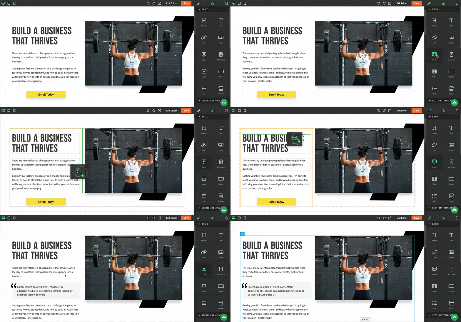
Here, you can adjust everything you see, such as text, images, videos, and buttons, and add product cards for your online course.
This is where you personalize your page to showcase your courses, challenges, or membership site.
Step 4: Fine Tune SEO & Publish
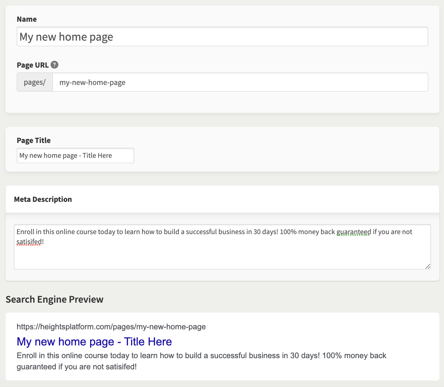
When you are done designing, go to the page settings to finalize and publish.
Here you can set your page title, meta description, and URL for SEO purposes. Once you're done, click "Publish" to make your page live.
Heights Platform includes an AI tool in the Web Page Builder for AI SEO recommendations.
You can use this tool to analyze your page for text structure, keyword suggestions, content optimization, and more to enhance your website's performance.
After you are done, you can create other pages for your website. To keep a consistent design, it is a good idea to copy your page and create a new one to customize. Alternatively, start fresh with a new style.
Try the web page builder and more AI tools to kick-start your course business today!
Create Your Course Website Today


