Create the Perfect Checkout Experience to Sell More Online Courses
6 minute readThe latest research show that 69% of online shopping carts are being abandoned by users. Among the biggest culprits of this number is the checkout experience.
Ensuring that you are proving the best possible checkout experience for your customers can significantly increase your conversion rate. Another study shows that businesses that improved their checkout experiences noticed an increase of 35% in conversions after optimizing their checkout.
These numbers apply to all online shopping businesses, but what about online courses?
Optimizing the checkout experience when selling online courses is even more crucial: most online courses are sold at a premium price, which means that potential customers take more time and convincing before reaching a purchasing decision. If on top of this you add a bad checkout experience, increasing conversion can get even harder.
If you are an online course creator struggling with conversions, this may not sound very promising. The good news is that you can easily optimize your checkout experience and recover lost sales following a few simple steps.
In today's article, we'll break down what makes a great checkout experience for your customers and how to increase conversions following our simple tips. Let's see them below:
#1: Add Clear and Visible CTAs
This doesn't only apply to the checkout page. Starting from the landing page of your business, to each online course and product page, it is crucial to offer a clear and intuitive CTA button for your customers.
CTA means Call to Action, and it is generally a button on your page that directs potential customers to complete a certain action, ex: "Learn More", "Buy Now", "Enroll for Free"...

It might seem obvious to you, but a clear CTA can make the difference between a conversion or a lost sale. If your website visitors are confused or left wondering how to get to the next step and purchase your program, chances are they will lose patience and leave your site.
So make it as easy as possible for them to buy your online course by placing your CTAs buttons in convenient places throughout your site.
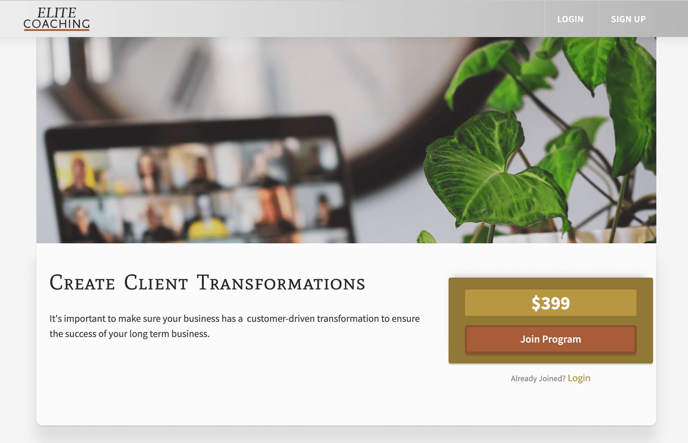
Heights Platform makes it easy for you and your customers by automatically generating landing pages for your business and for each individual product you are selling, where CTAs are strategically placed to create a seamless checkout experience.
#2: Use a Two-Step Checkout
There are different types of checkout processes out there: the most common differentiation is between a one-page and a multi-step checkout.
A one-page checkout, as the name suggests, is a checkout that can be completed by customers on a single web page, where they can insert all of their details, and payment methods and complete the transaction.
A multi-step checkout on the other hand spreads the process between multiple pages or steps. So customers might start by inserting their personal details, then confirm their purchase on the next page and finally complete the transaction by inserting their payment method.
Both approaches have their pros and cons, however, our personal favorite is the two-step checkout, where the checkout process is split into two steps:
- In the first step, a customer inserts their data (name, email, address...)
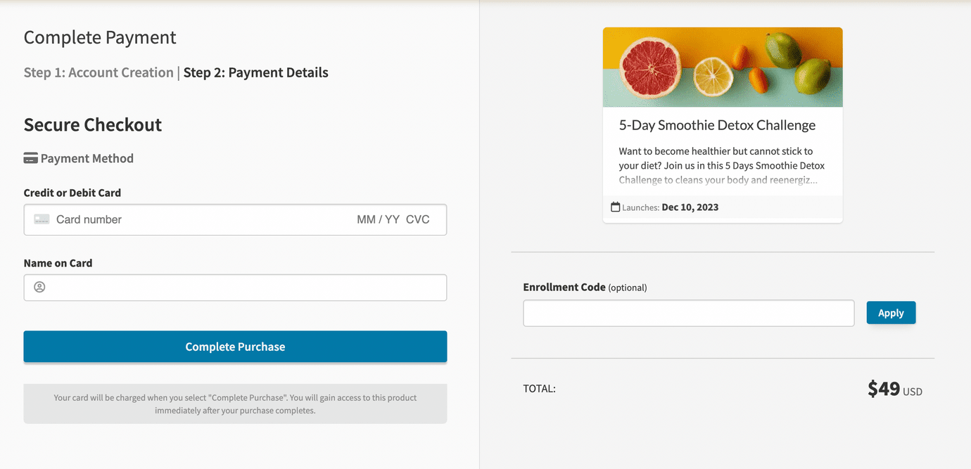
- In the second step, they select their payment method and complete the purchase

The reason why the two-step checkout is the most beneficial for online course creators is that you get to capture the leads' personal information (including their email address) before they complete the purchase. So if they decide to abandon the checkout, you still get to keep their email and their information is not lost!
This means that you have the possibility to send them an email to invite them to complete their purchase, maybe asking them if they need more information, or offering a discount.
Heights Platform's built-in checkout uses the two-step strategy to allow creators to capture leads and access information about potential customers who abandoned the checkout page, so they can reach out to them and invite them to complete the transaction!
#3: Allow Multiple Payment Options
Nowadays consumers expect to have multiple payment options available when purchasing a digital product such as an online course.
So it's good to be prepared and anticipate your customers' needs by adding all of the major payment providers – PayPal, MasterCard, Visa, American Express, Discover...
Heights Platform's checkout supports all of the above (and other local payment options) and offers seamless integration with Stripe and Paypal.
That said, depending on which country you are living in and your local payment processing regulations, the above options might not be available. So our advice is to check which payment methods are available in your region and provide a checkout experience that your ideal customers can feel comfortable using.
#4: Offer an Order Recap
Once the customer adds your online course to their cart and proceeds to checkout, they should be able to see a recap of what they are paying for, so they don't have to go back to your website and potentially leave the checkout.

This can simply be an overview of the course or digital product (the name, what's included, price, quantity etc...).
Heights Platform checkout automatically displays the order for your customers while they go through checkout, so there is no confusion about what they are purchasing.
#5: Be Clear About Your Fees
Many times potential customers abandon the checkout as they notice additional fees being added to their total amount. This is very common especially in eCommerce with additional shipping fees that are not advertised before checkout.
The same concept is valid for online course customers as well: if you are charging any additional fees, it is important to be clear about it, not only on the checkout page.
#6: Create a Mobile-Friendly Checkout Experience
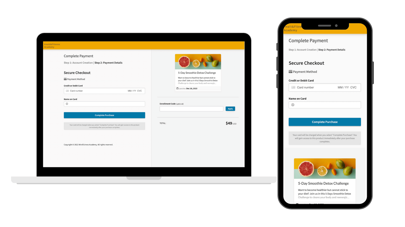
Your online course website should be optimized for use on every kind of device, especially on mobile. Today’s customers prefer to use the internet on multiple devices and oftentimes switch between laptops, tablets, and smartphones.

So it is important to offer a consistent checkout experience on all devices and sizes. Heights Platform is fully optimized for mobile use, so you can be sure that customers purchasing your course on their smartphones have the same experience and ease of use as on laptops.
#7: Provide Real-Time Support
Another way to optimize the checkout experience (and the overall experience within your site) is to offer real-time support to your visitors.
This can be done by linking a chatbot to your site to offer further assistance to your visitors and answer their questions in real-time.

There are countless chatbot software out there you can use to provide this extra service, and integrating them with your online course on Heights Platform is easy.
Offering real-time support doesn't only improve the checkout experience, but can significantly enhance your image in the eyes of potential customers who are looking to purchase your online course. As a course creator and mentor, offering support to your students while they learn and consume the content in your program can make all the difference, so why not show this off at the early stages of your customer relationship?
Learn all about proving the best support to your online course students: Guide on Handling Customer Service for Online Course Creators
#8: Offer Up-Sells
To make the most out of your checkout and increase the conversion rate, an idea is to offer product up-sells that potential customers can quickly add to their cart.
This can be hard to do if you are not using a specialized checkout software or online course platform. Fortunately, Heights Platform lets you easily customize upsells for each product purchase, and set a unique upsell price to make the offer even more enticing.

You can choose to offer upsells right at checkout, or once someone completes an online course, as shown in the picture above (or both!)
What to do After Checkout
The checkout experience doesn't end after a customer has put in their payment details. There are a few things you can do once a customer purchases your product, that will improve their experience even more.
First of all, make sure to reach out to your new customer right after you get a new sale. You can do this by setting up an automated message or even sending a manual email to them, including some important information about their new online course.
Check out this blog post to gain some inspiration about email marketing for online course creators: 7 Emails You Need to Send to Promote Your Online Course
Now what about those people who were about to purchase, but suddenly abandoned the checkout?
There is a lot you can do to recover these abandoned checkout sales.
In Heights, you can access a list of Incomplete Enrollments: these are users who have abandoned checkout before completing the payment process.
This is a great opportunity to recover lost sales from hot leads, who are for sure interested in your online course since they added it to their cart in the first place. Now that you have their details, you can send them an email asking them if they have any questions if you can help them with anything, or even offer them a small discount to further incentivize them to purchase!
Create Your Online Course Today


